Project Summary
Client
Stone Brewing
Wegmans
Contribution
Lead Designer
Illustrator
Description
Be prepared to lose yourself in lush layers of tropical fruit flavor with innovative hop ingredients that deliver dense, jungle-like intensity at every level.
Scope
16oz Can Label
Digital Assets
Platform
Procreate
Adobe Fresco
Adobe Illustrator
Adobe Photoshop
Adobe InDesign
Lush drift

The Process
Market Research
Researched top craft beer brands to find what works and what doesn't. Used these insights to create a unique position that would stand out on crowded shelves and connect with the right customers.
Concept Development
Created unique design concepts for the digitally printed 16oz can labels with colors that matched the beer's bold personality.
Built multiple options and clear presentations to help teams make smart decisions quickly.
Stakeholder Alignment
Presented concepts to creative teams first, then pitched to executives, brewers, and sales staff. Refined designs based on feedback to ensure the final product would work for both brand goals and business needs.
Execution & Production
Handled all regulatory approval with TTB and prepared files for smooth production. Delivered a complete brand toolkit including mockups, store displays, social content, and brand guidelines for consistent use across all channels.
Final Design
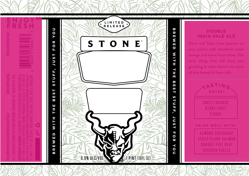
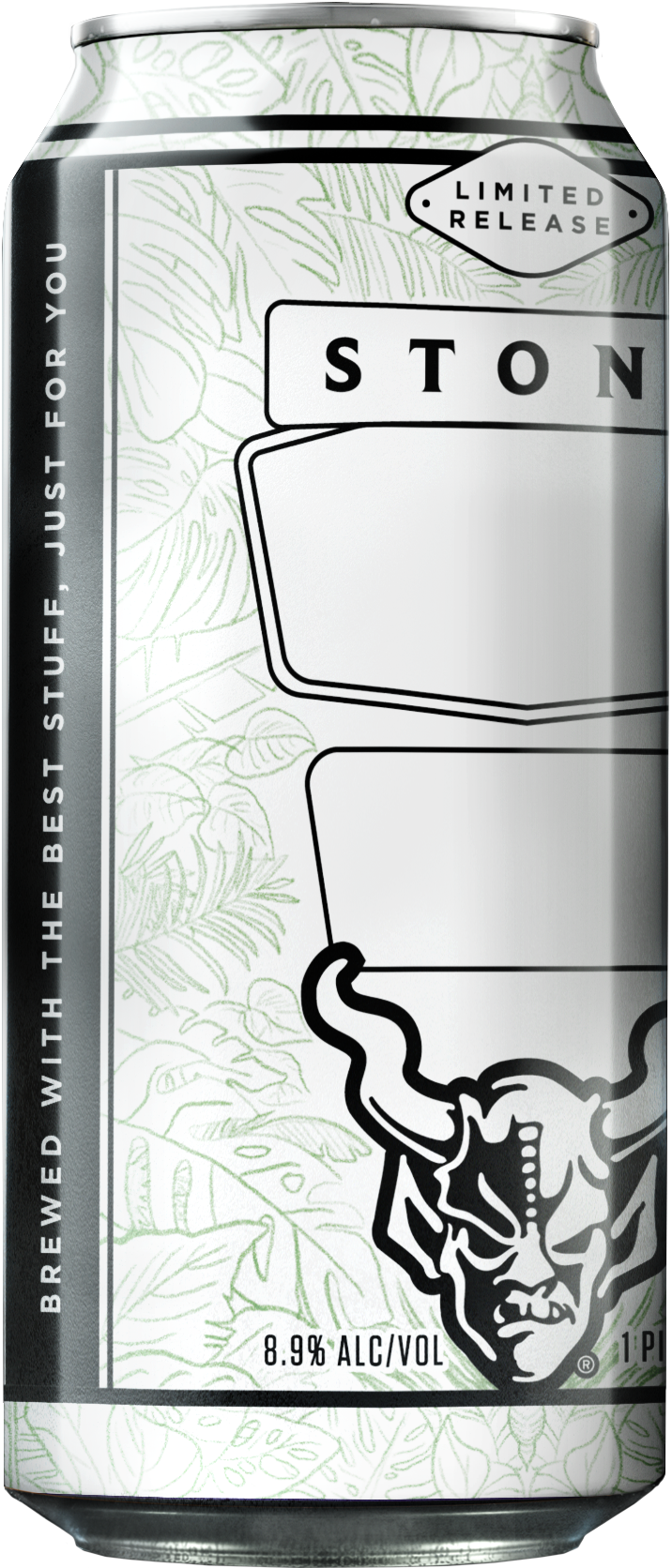
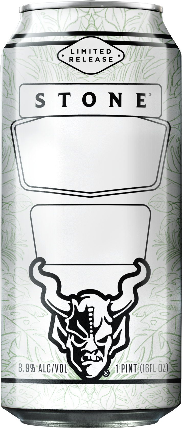
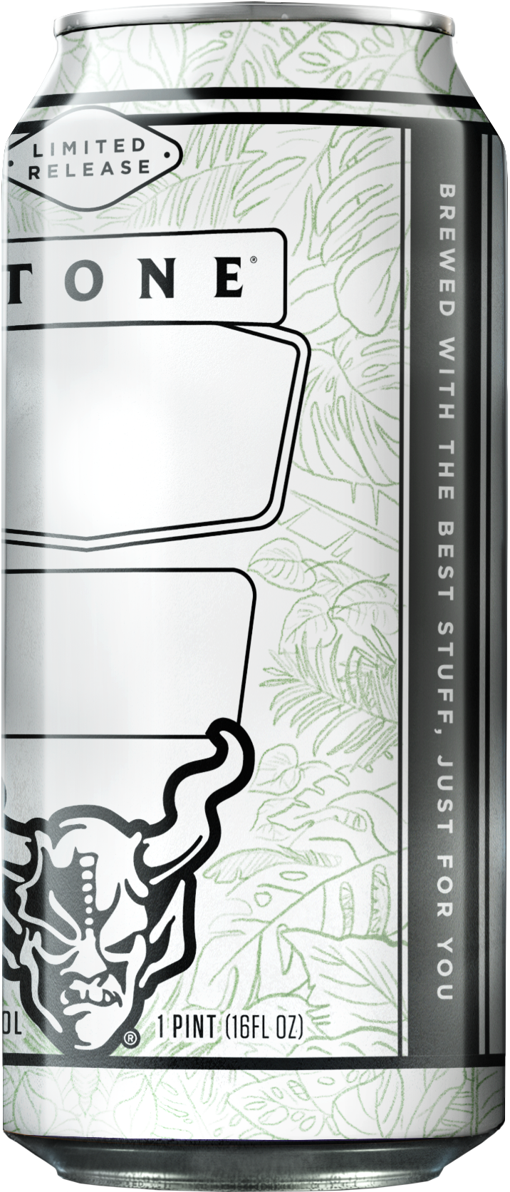
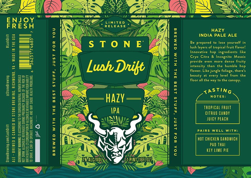
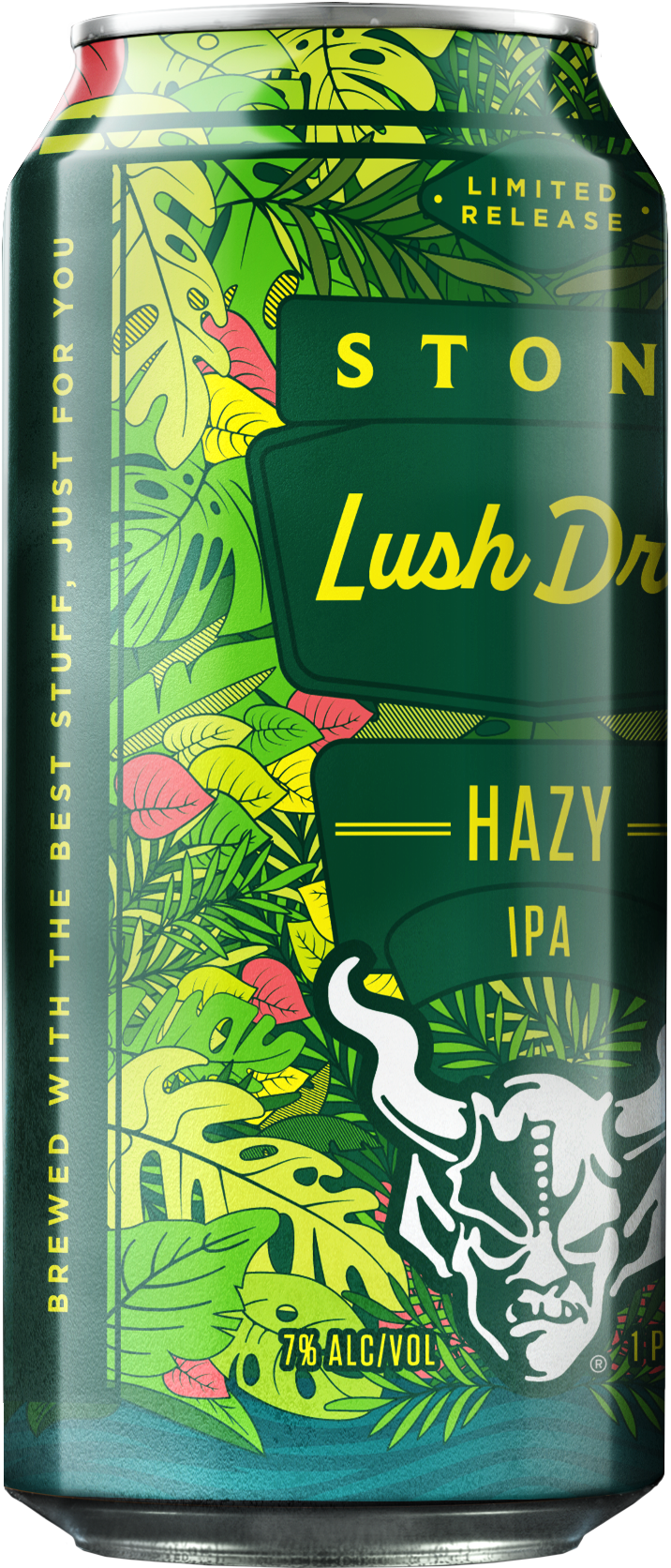
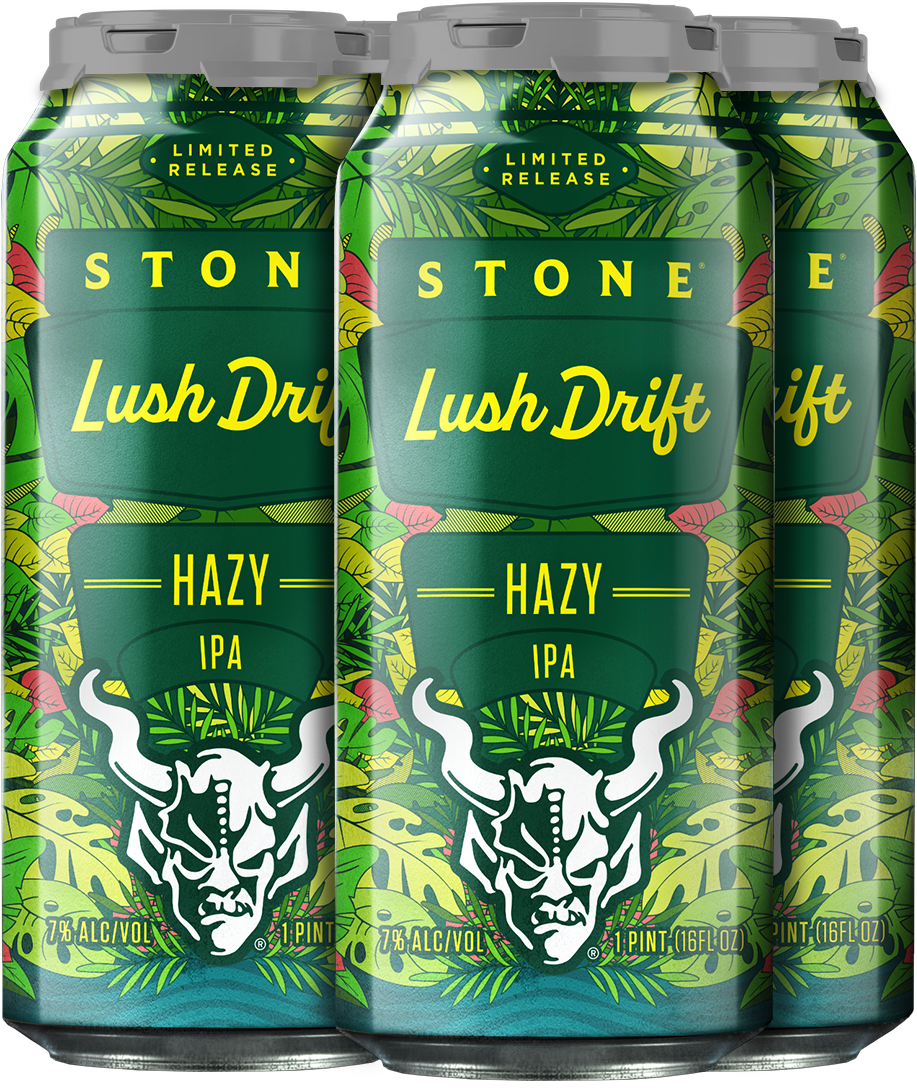
Based on Stone Lush Drift's tropical character and innovative hop technology, stakeholders gravitated toward a design that fully embraced the immersive jungle experience promised by the beer's flavor profile. The concept's vibrant botanical imagery—layered tropical foliage in rich greens with strategic pink and yellow accents—perfectly captured the dense, lush intensity of Cryo Citra and Incognito Mosaic hops while creating an eye-catching package that stands out dramatically in the crowded IPA market. This jungle-focused direction transforms the beer's 'beauty at every level' promise into a visual reality, giving Stone Lush Drift a distinctive shelf presence that immediately communicates its tropical fruit complexity to craft beer enthusiasts.
Concept Dev.
Option 01
This design captures the immersive experience of a dense, lush jungle environment with intricate botanical linework that evokes the untamed beauty of tropical foliage. The sophisticated monochromatic green palette will enhance the design through strategic yellow and white accents. This creates dynamic contrast and organic depth that perfectly complements the beer's intense tropical fruit character while ensuring premium shelf appeal.
Option 02
This oprion draws inspiration from elegant abstract florals, leaves, and hops to create an ornate, vintage-inspired visuals that commands shelf presence. This approach would utilize white botanical details against bold backgrounds with vibrant colors, pushing maximum visual impact and premium appeal that distinguishes this release from typical beer packaging.